Making media feel effortless in Messenger
I redesigned how media loads, plays, fails, and feels in Messenger.
I spent some time on Messenger's media experience. Loading, sending, browsing, failing. Every moment media touches the product, from the picker to the gallery to the error state.
Media is what makes messaging feel alive. A photo of your kid at the park. A video someone took last night. Media carries more emotion than text.
But the product often treated media as an afterthought. Loading was slow and it looked slow. Errors were silent. The gallery was a scrollable wall of thumbnails with no way to find anything. When uploads failed, people didn't know why, and Messenger didn't tell them.
I built a media vision strategy for the team with three pillars: fast, expressive, and reliable. AI and quality supporting everything underneath. The strategy guided our planning and shaped how the team generates and prioritizes ideas.
Fast
The media grid loaded with static gray boxes that blocked scrolling. The actual load time was fine, but it felt slow. We redesigned the loading experience with animated shimmering placeholders, free horizontal scroll, and smooth photo reveals. The real speed didn't change. The perceived speed did.
Video playback had the same problem in reverse: too many controls, layout jumps between preview and full screen, overlapping UI elements. We simplified it. Removed the jarring transition between states. Reduced the controls to what people actually use. Watching a video should feel like watching a video, not operating a dashboard.
Expressive
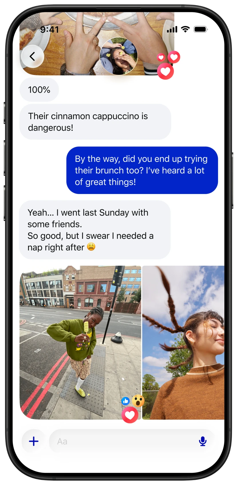
The thread gallery was functional but flat. A grid of media, sorted by time, with no way to filter or interact beyond opening one image at a time. We rebuilt it. Media Gallery 2.0 introduced filters by type and sender, a multi-selection mode to interact with several items at once, and a long-press menu for quick actions. The gallery became a place to find things, not just scroll through them.
We added reactions and replies directly from the media preview. Before this, you had to back out to the thread to react to a photo. Now you can share how you feel while you're still looking at it. A small addition that changes the rhythm of how people engage with shared media.
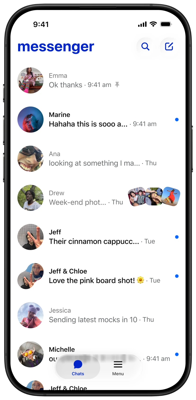
We also worked on the inbox itself. Rich context added visual cues showing what kind of message you received: media, mentions, links. The threadlist became more informative without becoming noisier. We worked on making the inbox feel more digestible through focused UI improvements, reducing clutter without removing information.
Reliable
When media fails, people blame Messenger. They don't know if it's their network, the file size, or a bug. They just know it didn't work. And the product didn't help them understand why.
We redesigned how Messenger communicates media failures. Alerts, visual indicators, and dialogs now show when errors are retryable, when Messenger will auto-retry, and when users need to reupload. The goal: reduce frustration and help people recover faster.
We tackled a specific failure scenario: when users exit Messenger while media is still uploading, the upload dies silently. We launched a notification that shows upload progress even after leaving the app, with Live Activity status on iOS. If something fails or takes too long, a prompt asks you to come back.
When media is missing from the gallery because of device changes, we now show a prompt to enable encrypted backup instead of leaving a confusing gap. An explanation and a path forward, not a dead end.
What I chose not to build
We reviewed Media Home, an account-level hub where people could browse their entire media history with filters and organization tools. After meeting with Core leads, we decided to pause. Thread Gallery 2.0 and Thread Details 2.0 were already introducing similar features at the thread level. We needed signal from those first.
The team had conviction about Media Home. But we didn't have evidence that it would create value beyond what we were already building. We chose to ship smaller changes to existing surfaces and measure whether the demand was real. If it was, we'd resume.
Shipping code
Within days of opening Xcode for the first time, I had a tappable prototype live on TestFlight. Teammates could test it on their phones, send feedback, and I could push updates the next day.
That changed how I design. I shipped 19 diffs to the codebase in one half, all with AI assistance. Layout fixes, spacing corrections, interaction bugs. Not concepts in Figma. Actual code running in production. It was my first step into prototyping and shipping in the codebase, something that today is completely integrated into how I design.
I started Designers Shipping Diffs, a weekly post showcasing designers who push code. It began as a personal initiative and scaled to over 500 designers. It became a talk at Facebook's AI4D summit: Vibe Coding for Quality.
During an AI sprint, I helped define Vibe Chatting for Messenger, a concept that tested well in research and moved into prototyping.
What this work taught me
Every project here was about the same thing: the gap between what actually happens and what the person experiences. The loading grid isn't faster, but it feels faster. The error isn't fixed, but now you know what happened. The gallery has the same media, but now you can find it.